Showing posts with label Constructing Digipak. Show all posts
Tuesday, 18 March 2014
Monday, 17 March 2014
Updating Digipak, Insert and Magazine Advert
After I completed my first draft of my digipak and magazine advert I asked for feedback from my fellow students and friends outside of my media class. I developed a very quick questionnaire which addressed and inquired after the opinions of the audience on particular issues I found with my products, as well as generic questions on what was good/bad about them. I was pleased with the results as the feedback came back to be mainly positive with only minor adjustments/improvements needed.
In my magazine advert, I have adjusted the text size/balance to create a more conventional layout that doesn't look too cluttered and is without any unnecessary information. I deleted the contrasting text even though I quite liked the effect, as the extra text took away from the image of my front cover and meant I was not showing a true representative of my album cover on the advertisement. I also adjusted the size of the social networking logos at the base of the advertisement as some people commented they seemed slightly too small in relation to the rest of the advert. This also brings them further into the main focus and would hopefully grab the attention of the viewer and subsequently encourage them to follow up the artist using these sites.
In my digipak, I have made several small changes in relation to the feedback I received. On the inside, I added a ring of text around my CD holder to liven up that space and create more detail as a few comments reported it to be lacking in that area. The text is not necessarily for information, but more for aesthetic effect. Although this ring of text took me quite a while to achieve on Photoshop I am pleased with the result it gives. I also changed the font of some text I added to the right panel into the font I have used almost throughout, as the plainer font was too plain according to some more feedback I received. On the outside I made hardly any changes except to adjust the sizing and layout of the small credit text on the back of my digipak, so that it was clearer and easy to read.
Saturday, 15 March 2014
Inspiration for insert
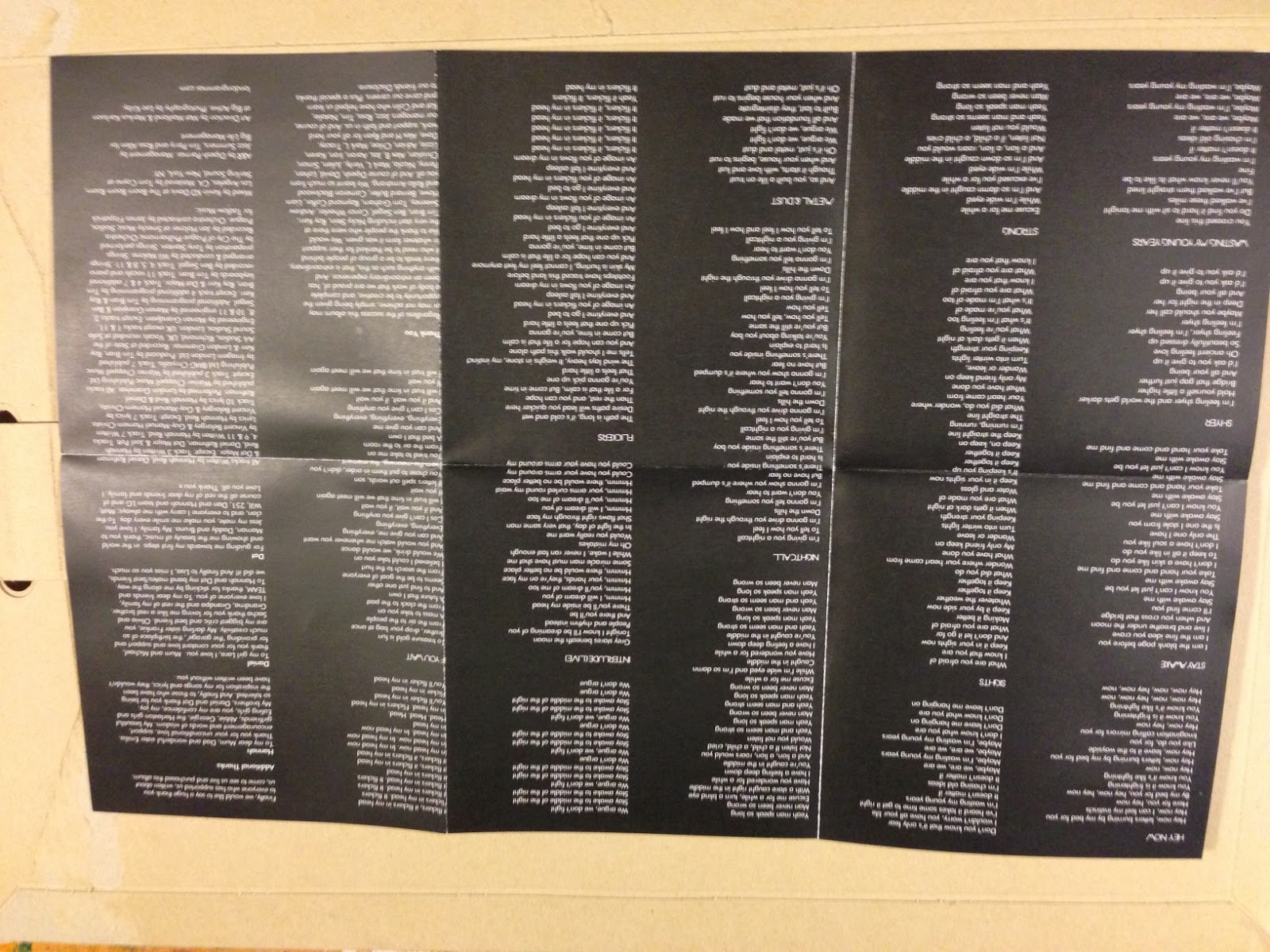
I have been inspired to create an unconventional layout for my insert. I have decided to use a two fold booklet insert that has the lyrics and credits on one side and a poster on the other. The advantage of this insert is the poster, as this is a free piece of fan 'merchandise' for the audience and also could promote publicity if it was displayed.
Here are some photographs of the London Grammar album insert which uses this format.
Thursday, 27 February 2014
Wednesday, 26 February 2014
Digipak contstruction- insert and mini poster
For my insert I chose to use a six way fold technique that allowed for six panels each side. This is because I wanted a space big enough so that one side of this insert could be folded out into a mini poster for the owner of the digipak. This creates a free piece of merchandise for the audience and could encourage publicity if it was put up somewhere others would see it. I first drew the squares each 11 by 11 to make sure they would fit (once folded) into my digipak slot of 12.5 by 12.5. To create the poster side I then again used one of my images from my photo shoot and used photoshop elements to edit it to my liking (straightening, brightening etc).
I then used a circle tool to create a spherical shape in the middle of my image for my text to go in. I used the transparency tool bar to adjust the opacity and make the circle faded so that some of the image was still visible through the shape. Finally I added text across the center of the circle to show the name of the artist and complete the poster.
To finish the panels I added a thanks to one of the panels and a crediting panel to the other. The panels read "Thanks" "Kordula would like to say a huge thankyou to all involved in the making of this album. Without the continued support of fans, friends, family and our amazing production team this would never have been possible. A special thank you to moon and rust records "
"All tracks written and recorded by Kordulas Published by moon and rust records Mixed by Kain Davis at boomsoundroom Los Angeles CA, Mastered by Tom Sterling at SterlingSound CA Art Direction by Kacy Maitland at Dotscop"
"www.kordulasmusic.co.uk"
To finish this side of the fold out insert I added a circular image I cut out on photoshop and faded it so it wouldn't make the text over the top unreadable.
Here are the two sides of my insert fold out. (The grid lines show where the panels fold)
Tuesday, 25 February 2014
Digipak construction- using a cut out
After some deliberation I have decided to have a cut out circle on the cover of my digipak. This is a technique I first saw on the XX's album cover. The right panel is technically my front cover, however here I have placed a circle to show where there will be a cut out. The left panel shows the image that will show through this cut out to form the cover. I feel this will add a more edgy look to my digipak and ideally encourage the audience to pick up the digipak and investigate further. I also like the idea that the circle cut out is like a window or a porthole, showing the sea behind.
Here again I have put a circle cut out space as this would be the other side of my front cover. The third panel would fold to go over the CD itself (middle panel) and the left panel would then fold over this to create the cover.
Digipak construction- inside the digipak
Inside the image I decided to use one image spread across the three panels. This is an idea I had seen in other digipaks and thought it was very effective. I also felt I needed to balance the white and simplistic cover I had created. I chose an image that depicted footsteps walking towards a frothy shoreline. I feel this links well to my music video in which my artists are walking along/towards the shoreline. The right panel has an extra cut away to show that this is where my insert would go. I chose to create a curved edge to mimic the undulating shapes seen in my photography with crashing waves etc
Digipak construction- the spine
Creating the spine was a very simplistic piece of graphic design. I decided to again keep the white background of the front cover and the back cover so that the cover in itself would seem seamless and an ongoing graphic. I added the name and album title in a grey font to provide a subtle effect that would still compliment the theme of the digipak. The name I chose to be in a slightly larger font to make it stand out and catch the viewers eye. I also added the record company logo again, but faded it so that it would not detract away from the name or album name.
Digipak construction- logo development
I decided to create my own record company logo instead of simply copying one onto my digipak. I invented a record company named "moon and rust records". I wanted to use the imagery of the moon mentioned in the name, so I downloaded a crescent moon graphic from google images that was free to use. I chose the image because of its circular shape which always proves well for a logo and placing over other images. It also holds a very simple colour scheme of black and white which can also go over many images and on a variety of products without clashing. A logo must also not be too detailed or complex as this can make it look cluttered and a bad graphic design. Sticking with the minimalist and graphic theme I decided to apply only the letters M and R to represent the record logo. Using adobe photoshop elements 11 I applied the text. I also decided to edit my logo further and make use of the black and white divide to present contrasting font colours on each side and highlight the crescent moon image. Here is my final result
However I did also create another logo so I would have a choice between the two for my digipak. This logo would also appear on my magazine advertisement so I wanted it to be right. To be safer I went for a very obvious shape of a crescent moon, and simply filled it with black text. This created a much more simplified image which I felt didn't look as good as my first logo, but could be of great use if the image you were placing it on was very busy allready. It also immediatley puts across the record company and is a very distincitve shape.
Digipak construction- back cover
For my back cover I wanted to continue the use of a white background that I had used for the front cover. However I did not want to simply have a plain and blank looking digipak. Therefore I decided to take my wave theme and apply it to the back. I chose a section of the wave from my photographs and cut it out using the eclipse tool on adobe photoshop elements 11. I then decided that I did not want a very bold image on the back cover as this could distract away from the front cover. I changed the transparency/opacity settings to fade the image and create a subtler look.
I then added in my track list in a very simplistic grey that would compliment the faded image. I also added in the record logo just beneath the track list to show the importance of the record company. I then added a small white image of the twitter, facebook and soundcloud logo to encourage the audience to research the artist using these media outlets and increase publicity. I downloaded a barcode from google images and faded it to go with the image. Finally I added in a very small font "moon and rust records 2014" as well as the artist website to again increase publicity.
Digipak construction- the front cover
Here I have chosen an image of the shoreline which I feel is particularly effective and has a good balance of colours. It also mimics a shot from my music video, and using a similar shot will ideally enable the audience to make instant connections between the two and create a synergy between my products. I then decided I wanted to alter the shape of the image. I chose a circular image because I feel it is very strong graphically, and creates a good shape which draws the eye in to the center and focuses on the wave. I also decided to mimic the theme running through the name of the artist "kordulas" which stems from a star constellation, therefore using a planet like orb seemed appropriate.
To edit my image further I decided to take another shot of the waves I had photographed in my shoot, and layer this image over the top. I cropped the image to the circle shape and layered it over the original image. I then adjusted the transparency or opacity of the top image so that you could still see aspects of the first image. I chose this look to mimic a cross blend editing technique I used in my music video, in my video I also used two shots of waves overlapping which provides a direct reference.
I then needed to add text to my graphic as this would be used for the front cover. I had already researched fonts on www.dafont.com and downloaded a free to use font specifically for this digipak. Using the text tool I positioned the name across the center of the circle and chose white for the font colour as this helped the word stand out against the photograph and complimented the colours within the image.
I then spent some time re-positioning the text and my image until I was happy with it. I decided to display the text across the center as I felt this played nicely into the rule of thirds and helped exaggerate the horizon line/crashing waves. I then decided this image was too predictable for an up and coming fresh new band. Therefore I decided to rotate my image to make a more interesting graphic. I settled on the sideways photograph as I feel it works well within the circular shape and helps the eye to follow the word across the frame.
Subscribe to:
Posts (Atom)