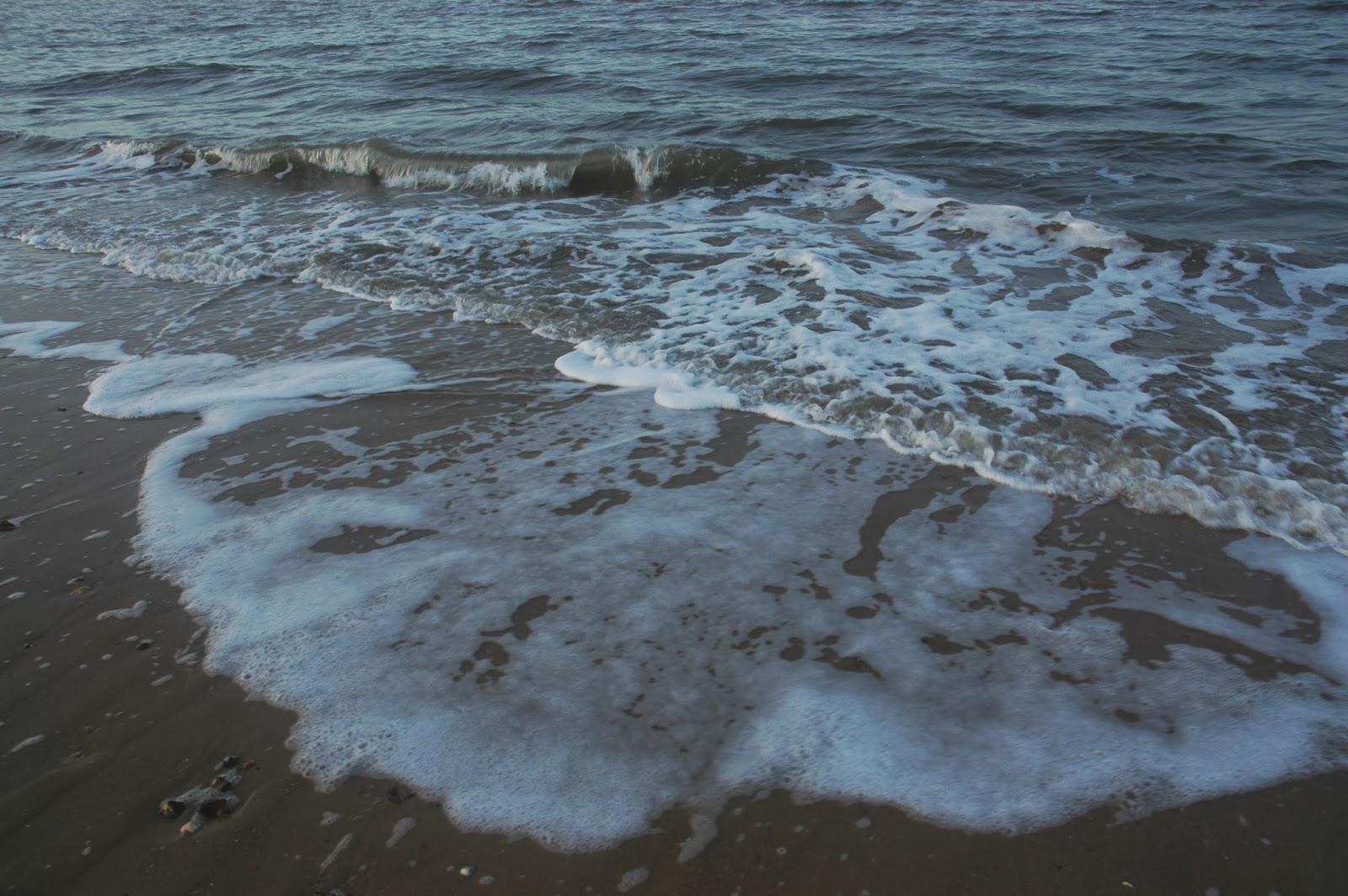
I have completed a photo shoot for my digipak. As my music video held strong links and featured a large amount of imagery surrounding the sea and waves I have decided to continue this theme through to my digipak. This will help the audience associate my music video with this project, and with the use of synergy create a more professional look to the overall production. To really keep this consistency I had originally thought to take screenshots from my music video. However I found that the quality of the screenshots was just too low to produce a graphic/image of a high enough standard for me.
Therefore I decided to take new photographs that would be of a high quality. I shot these photographs in the same location as I filmed my music video, to again keep consistency. Wells-next-the-sea beach provides a very good location for photographs as it holds a large flat and sandy expanse that provides very graphic shots. I chose a time of around 4:30 in the evening as I wanted to capture a softer lighting upon the waves. To try and keep my shots very similar to that of my music video I kept the photographs mainly tightly focused on the waves and the water crashing against the shore to mimic those shots of my music video. I am happy with the shoot as I feel with these images I have a good scope to take aspects and create a suitable, interesting and professional looking graphic for my digipak.
Here is a comparison of a few shots from my music video along side the shots from my new photo shoot for my digipak.
Here is a slideshow of my photographs: